Frontend SDK
Change colours
Overview
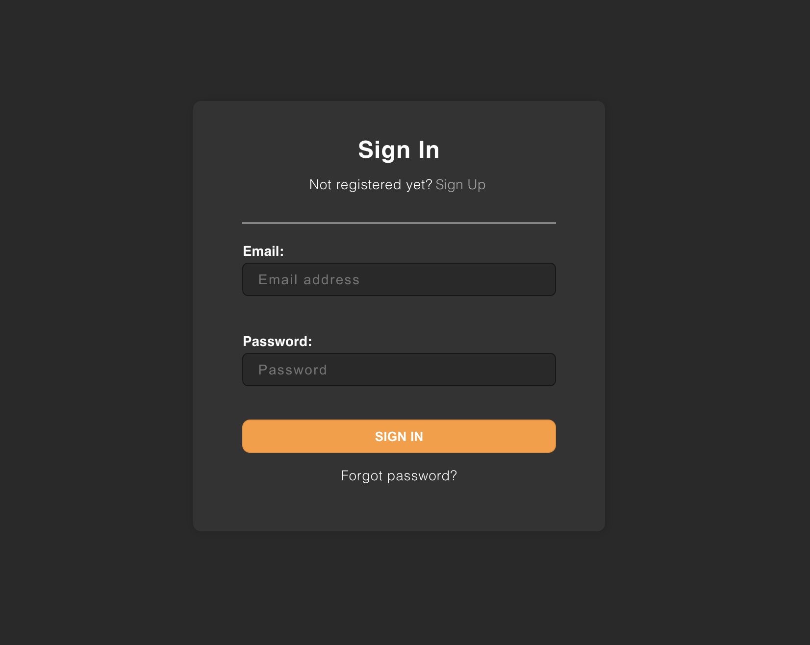
You can update the default theme with your colors to make it fit with your website. Define a few CSS variables in the style property to the EmailPassword.init call. Specify the colors as RGB (see the following example), because the rgb and rgba functions apply them.
For example, if your website uses a dark theme, here is how you can customize it:
Before you start
This example is relevant only if you use the prebuilt UI components.
Example
import SuperTokens from "supertokens-auth-react";

SuperTokens.init({
    appInfo: {
        apiDomain: "...",
        appName: "...",
        websiteDomain: "..."
    },
    style: `
        [data-supertokens~=container] {
             --palette-background: 51, 51, 51;
            --palette-inputBackground: 41, 41, 41;
            --palette-inputBorder: 41, 41, 41;
            --palette-textTitle: 255, 255, 255;
            --palette-textLabel: 255, 255, 255;
            --palette-textPrimary: 255, 255, 255;
            --palette-error: 173, 46, 46;
            --palette-textInput: 169, 169, 169;
            --palette-textLink: 114,114,114;
            --palette-textGray: 158, 158, 158;
        }
    `,
    recipeList: [ /* ... */]
});
important
Changes to the palette apply to all the UI components provided. If you want to change a specific component, please see this section.