 Pre built UI
important
Please select a recipe to get started
Authentication Methods#

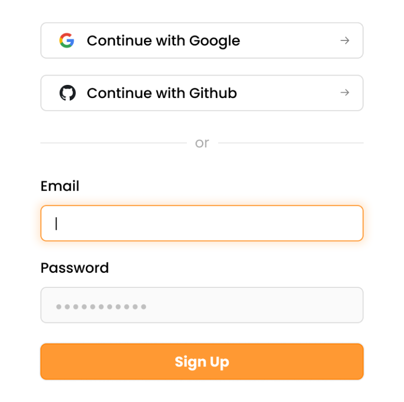
Email password with Social / Enterprise Login

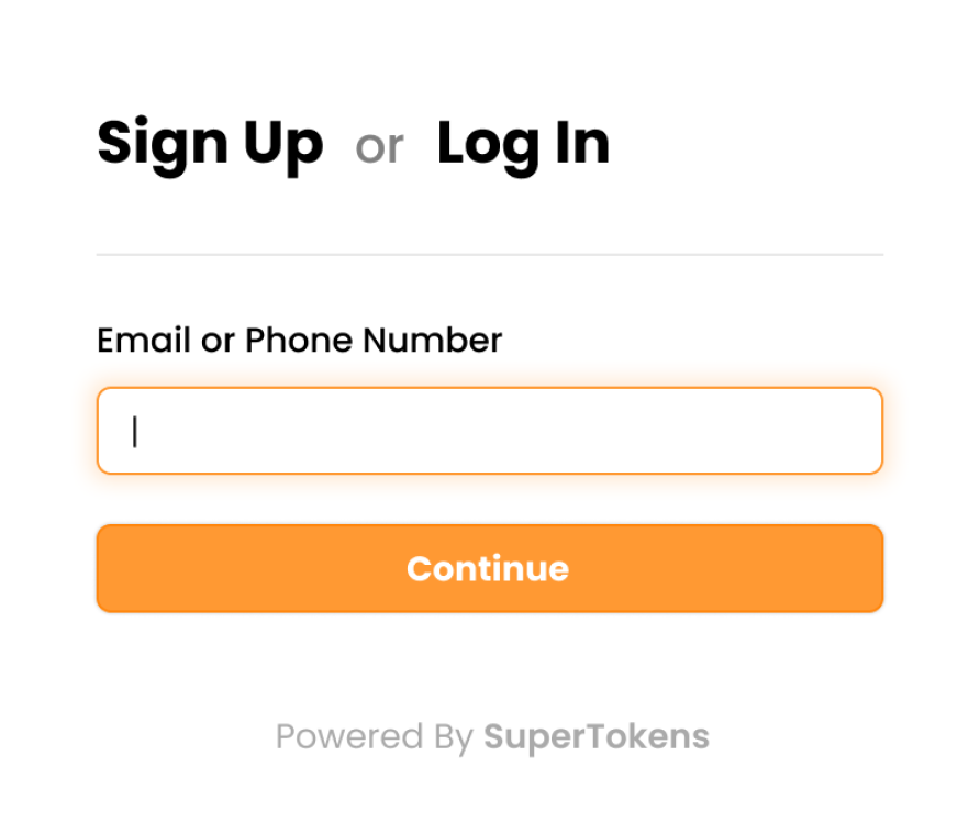
Passwordless

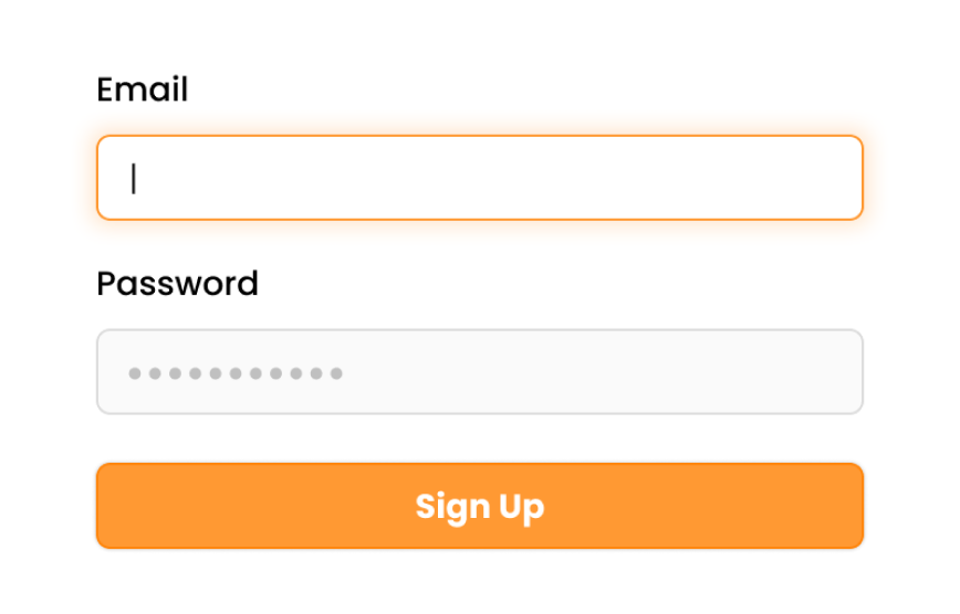
Email password Login

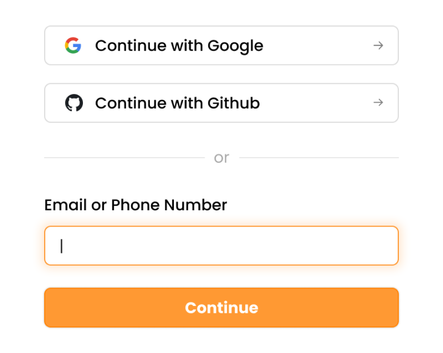
Social / Enterprise Login with Passwordless

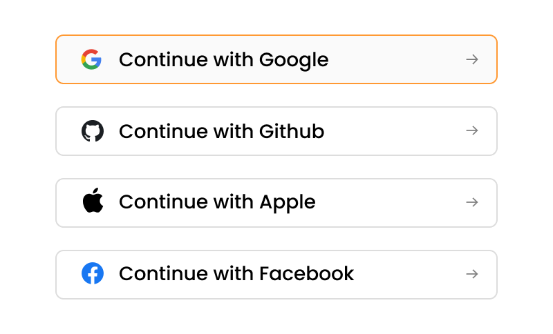
Social / Enterprise Login

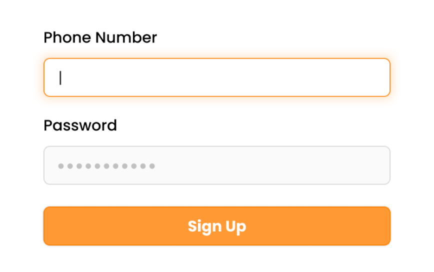
Phone Password Login
Add-ons#

UserRoles (RBAC)

Multi factor Authentication

Microservice Authentication

Session Management

User Management Dashboard

Multi tenancy / organizations

