
You may have noticed that there’s something different about the SuperTokens website lately.
Your eyes don’t deceive you, and the rumors are true ;)
We’ve revamped our website and onboarding experience - our goal is to empower developers with open source, powerful authentication and the new interface is a step forward to reaching that goal.

This is a #buildinpublic piece on why we went for the redesign, our approach, and what we learned throughout the process.
Why the Revamp?
We first launched our website in 2020. By 2022, we had changed so much as a company, but the website had simply not kept up.
Our core product had rapidly evolved and as new features were released, we added them in piecemeal - nothing was optimized for cleanliness or conversion.
Since we first launched the site, we’ve shipped:
- User Roles
- 2FA
- SAML
- Microservice Auth
- Passwordless
- Account linking & multi-tenancy
Some screenshots of our old website:


We knew we wanted a more breathable, developer-friendly aesthetic that matched our brand and product.
We also needed to optimize our webpage to better accommodate our user journey and gel better with our new CLI strategy.
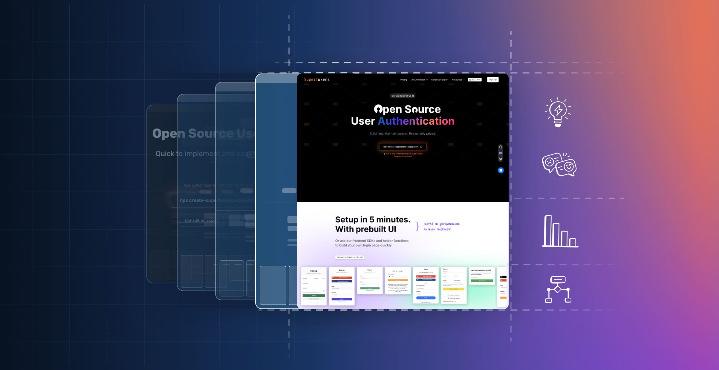
The New SuperTokens Experience
During discussions on how we wanted to improve in the new site, we realized that we didn’t really care about signups - the number of signups was a vanity metric. It didn’t matter how many signups we had if users didn’t fully understand how to implement SuperTokens post-signup.
We wanted our visitors to easily understand SuperTokens and for interested users to get started quickly and easily - whether it was with a self-hosted implementation or our managed auth solution.
This question became our north star: “How do we make the journey to active user as frictionless as possible?”
We wanted to:
- Reduce cognitive load and technical jargon
- Reduce the number of steps & friction necessary to try out SuperTokens
- Update our site to reflect new features
- Place signup later in the user journey, with more guidance immediately after signup
With our CLI as the no-brainer way to get started with SuperTokens in less than a minute, our CTAs now guided users towards our documentation and our Discord community for questions and support.
The user journey before:
Sign up → docs → implement frontend → implement backend → implement core
And after:
Consult docs + join Discord → implement frontend → implement backend → sign up → implement core
Our Approach
- Research
- Analyze Prior Data
- Paper Layouts
- Wireframes
- Figma
- Interview Users
- Webflow
Step 1: Research
Before starting anything, we wanted to make sure we based our design and layout decisions on empirical data and research.
Success leaves clues - Jim Rohn
To get an understanding of the evolution of design in the dev tool space, we used the Wayback Machine to look at how designs have changed over time. In looking at competitors and other companies in the dev tool space, we wanted to observe what content/messaging was added or subtracted from their sites to truly grasp what worked and what didn’t.
We created a detailed FigJam diagram of all their information architecture and website structures (not shown here) to get an accurate lay of the land.
This research process allowed us to be incredibly thorough and precise with our own design.

Auth0’s homepage from 2020
Outside of the Wayback Machine, we looked at current homepages from other notable teams:
Linear

Rudderstack

Stripe (duh, how could we not)

Apple Developers pages

Duffel

Airplane.dev

Supabase

We learned from our Twitter and Reddit research that developer tools seemed to find success with gradients, dark themes, and minimalist design - all seem to be corroborated by the examples as well.
Step 2: Analyze Prior Data
Between our Discord and five to ten calls a week with prospective and active users, we were able to gather a lot of qualitative feedback on our existing site.
Plus, with consistent feedback from users along with data from Hotjar and Amplitude, we could identify specific areas of friction or confusion for our users.
Two spots in particular on our old site come to mind:
1) The “We Are” section
We took inspiration from Amazon’s three ‘pillars’ of customer wants: faster deliveries, more inventory, and cheaper prices.
For SuperTokens, we aim to provide our customers a better developer experience, with an open-source solution, and complete sovereignty over their auth implementation.
We wanted to detail each of these pillars here, with details about what we do specifically for each.

But, our Hotjar recordings showed that people did not stick around to read it - it was just too much text.
2) The “How It Works” section:
SuperTokens’ architecture is unique to all other auth providers. Apart from being a valuable selling point, we originally thought that providing context early would make understanding everything else about SuperTokens much simpler.

But similar to the other section, there’s a lot going on. The ‘Back’ and ‘Next’ buttons at the top walk the user through how SuperTokens works.
However, it didn’t have the intended effect. Instead of simplifying, it introduced extra cognitive load and made it seem like SuperTokens was difficult to use. Few people clicked on the buttons at all, and only 0.5% percent of our visitors actually clicked all the way to the end.

Since it wasn’t doing what we wanted it to, we decided to remove this section entirely.
Eventually, we found better ways to communicate the architecture in a more complete way through the docs.
Step 3: Paper Layouts

With our research and a good idea of what we wanted to say, we sketched out our different content sections of the homepage by hand.
Pro tip: You should use pen and paper for figuring out your layout first, then move to wireframes.
Why?
Pen and paper are much quicker for prototyping. Sketching different approaches to a design is fast and helps to bring clarity. It’s simple to add or remove sections as you go, and we managed to arrive at something we liked within an hour or two.
Step 4: Wireframes

Based on our paper layouts, we created basic wireframes to start assembling everything digitally. This intermediate step allowed us to start playing with our ideas from the paper stage, without focusing too much on final polish too early.
Step 5: Figma
After playing around with our basic wireframes, it was to design and assemble the flow of the webpage. We added in brand color and created polished versions of the wireframe components.
Then, when we were confident we had a couple of good design iterations, we kept dummy content the same while switching between different designs to see which ones worked better.

By using both content variation or design variation, we were able to isolate which design and content would work best independently, and then in conjunction with one another as well.
Step 6: User Interviews

Some screenshots of interviews with our users:

With the homepage built, it was time to see if we had indeed made the progress we wanted in the first place.
For authentic first impressions and unbiased feedback, we wanted to get users who were unfamiliar with SuperTokens. Thankfully, our post on Twitter was enough to get the ball rolling and we started interviewing!
In our conversations, we asked users to scroll through the homepage and narrate their thoughts aloud. Their thoughts were useful :
- Anything that they mentioned was primary information - the important stuff. This let us know what was actually registering in our users’ minds.
- Anything that they didn’t mention was classified as secondary information. Naturally we would ask ourselves and the interviewee: “Why was this secondary information?”
- Was it the content?
- Was the the UI?
- Both?
We incorporated the feedback by playing around - a lot - in Figma.

And here are some the final versions of the sections we tweaked based on user feedback!


Step 7: Webflow

Once the design was done, it was time to implement everything in Webflow. While a lot of the custom JS took some time to get right, it was much easier to get everything designed and onto the page with Webflow instead of needing to flesh out individual components in React - which we knew more than likely we’d have to tweak and change over time anyway.
We Learned a Lot!
Iterating through the website design with user interviews gave us a lot of surprises.
Build vs Buy
There were two ideas that we wanted to communicate:
- Building your own auth is difficult and expensive, and buying auth is rigid and expensive
- With SuperTokens, you get the best of both worlds with none of the drawbacks, whether you choose a hosted or self-hosted plan.

However, those two ideas were too difficult to convey in one section of webpage and it was too confusing for our test users - so we removed it altogether.
Logo Info
We learned that people liked the logos, but didn’t get a high amount of trust from them because they were unfamiliar with the companies. We added in description tags which would show on hover, which explained more about the logo.
Before:

After:

We got a lot of feedback that people loved the added context.
Too Long!
80% of our interviewers thought the new homepage was too long! We took their feedback and shortened things up to include only the most important pieces.
Confusion with Low Contrast
We saw users get confused on multiple occasions because of contrast.
For example, it was unclear to many that a new section of the page had started here:
 Thankfully, this was an easy fix and in subsequent interviews this issue was no longer present.

The Custom UI Section
This was a particularly interesting section to debug, because there were several aspects that needed changes.
Firstly, many users tried to interact with the login cards as if they were part of a horizontal carousel. When the cards didn’t behave in the way they expected, users felt confused.
To counteract this friction, we made the cards scroll horizontally automatically as the user scrolls down the page vertically - no input necessary.
Second, the “Hosted on yourdomain.com, no more redirects!” was a crucial piece of text that we played around with to get right.
In prior conversations, we found that our users didn’t mention this piece of text or even notice it at all when asked about it later. After playing around with its position in the section, it started to be mentioned unprompted - success! Full ownership and no redirects is one of the biggest advantages to using SuperTokens, so it was important to us that users knew about it even with a casual glance.
Some users didn’t know that you could click on the tiles to actually see the live login pages - so we animated the cards on hover.
Here’s what the final version looks like:

Webflow, Webflow, Webflow
After crunching some numbers, we estimate that implementing this new homepage would have taken us 3-4x longer to implement with React.
There was no need to create custom components for one-offs that will inevitably change over time. That, and we could keep our engineering team focused on building good auth instead of dialing UI in by hand with React.
Conclusion/Results
We had a lot of fun redesigning the homepage and we learned a lot about how to create a page that’s truly engaging to users.
Starting with research and keeping ourselves oriented with empirical data made sure the process was smooth and thorough.
We were touched to see our efforts get noticed:


Most importantly, our site was performing way better:
- 50% increase in visitors reaching the bottom of our homepage - from 8.7% to 13%
- Average increase across all meaningful CTA conversions was 68.5%
- Signup clicks on our header doubled from 1.9% to 3.8%

The difference was night and day!
If you found this valuable, follow us for more build in public content, or check out our docs to get started using the easiest open source auth solution!